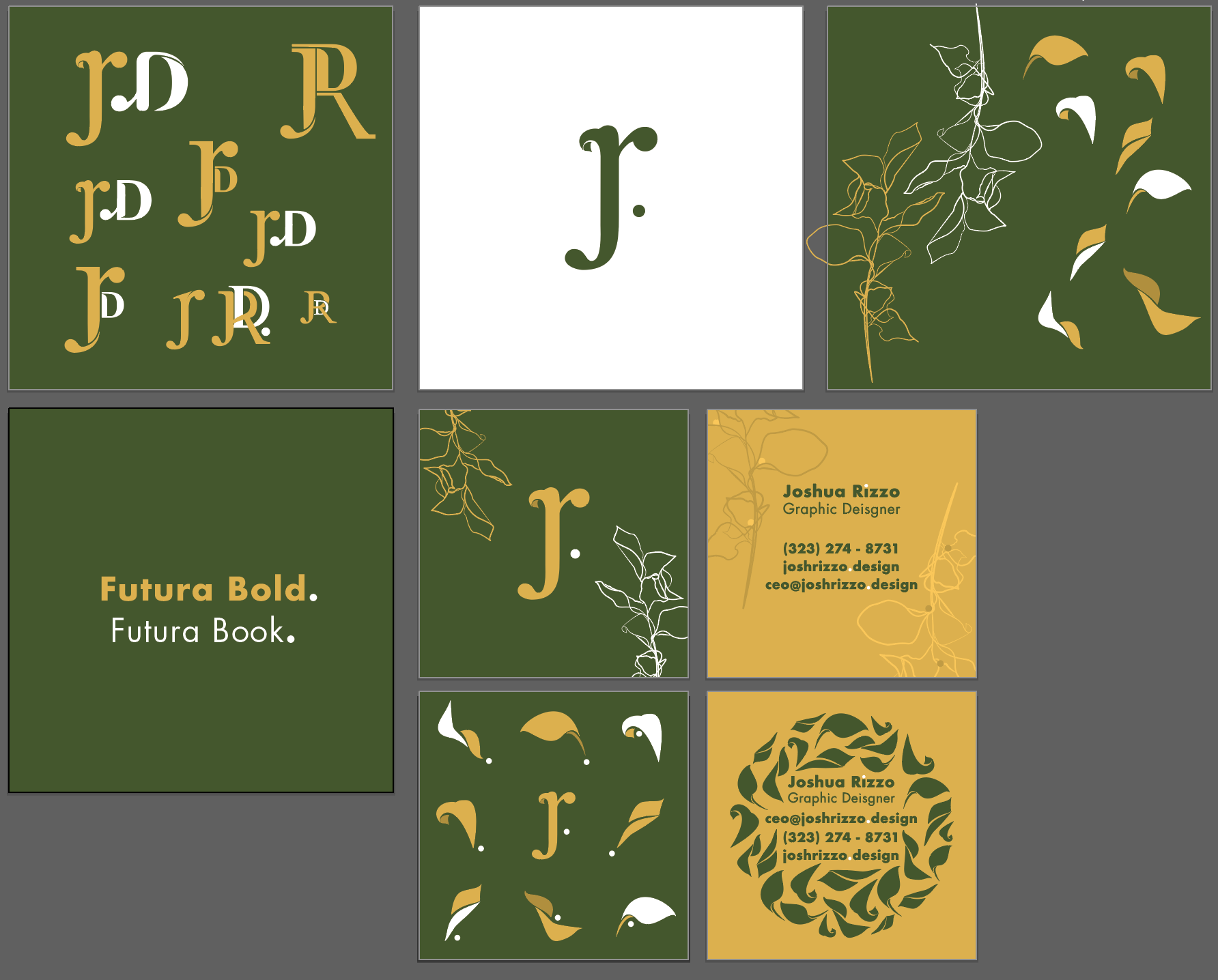
I shortened my identity mark for several reasons. For starters, the D stood for design, and I didn’t want to make that a part of my identity mark as much as I originally thought I did. I also figured that simply having the period besides jr was sufficient in demonstrating the significance of it. It is the end of the abbreviation of my name; the beginning of something else; something new. That is the point of natural growth; where my identity ends and where new life begins. Essentially, a period of time where creativity is born.
Green pointed out how prominent the dots are. She doesn’t like circles because they are too attention-grabbing. My logo is camouflaging along with the other graphics as well. Find other solutions to the circle on the back of the businesses card. She likes the pattern it makes but she doesn’t like how my text is hidden in it. No corner to corner design.
